Tổng hợp bài mẫu IELTS Writing Task Two của thầy Simon 2013-2019
Nhấn vào đây để tải file PDF về: Simon_Task_2
Nhấn vào đây để tải file PDF về: Simon_Task_2
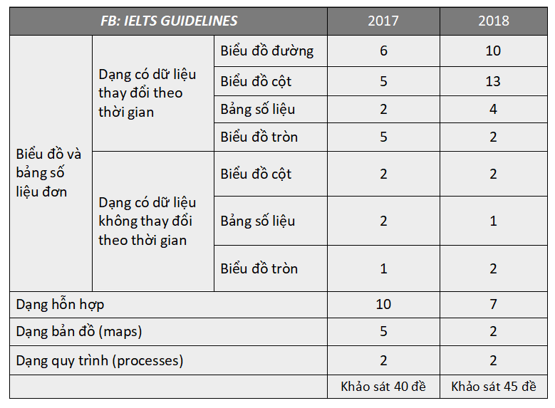
Đây là bảng bắt buộc tất cả mọi người phải nhớ được trước khi tiến hành ôn luyện hay đi thi IELTS trong năm “2019”. Không nắm được tỷ lệ ra các dạng của IELTS Writing Task One này là nắm chắc 50% ăn hành với Writing rồi ^^. Nắm chắc bảng này, phân bổ nguồn lực đúng nơi thì tỷ lệ đạt target sẽ cao hơn nhiều lần lắm!! Đừng coi thường nó, tui đã phải vất vả để…
Pie Chart The charts below show the results of a questionnaire that asked visitors to the Parkway Hotel how they rated the hotel’s customer service. The same questionnaire was given to 100 guests in the years 2005 and 2010. THE INTRODUCTION Chúng ta thấy các biểu đồ tròn này tạo ra là để: + So sánh về mức độ hài lòng của khách hàng tới khách sạn Parkway trong năm 2005 và năm 2010: – The pie charts compare the satisfaction…
The two pie charts show the exportation of products from Australia over two years. Trước khi bắt đầu viết introduction cho phần này thì chúng ta cần nhớ mỗi khi xử lý một dạng biểu đồ nào đó thì việc quan sát xem có cột thời gian hay không là một điều rất quan trọng, bởi vì ngôn ngữ cũng như cách xử lý đề bài đó sẽ khác nhau rất nhiều, không chỉ là phần introduction mà là cả…
Bar chart The chart below shows the amount spent on six consumer goods in four European countries. THE INTRODUCTION Biểu đồ này cơ bản chỉ được tạo ra để so sánh lượng tiền được sử dụng vào những sản phẩm tiêu dùng của bốn quốc gia: The bar chart compares consumer spending on six different items in Germany, Italy, France and Britain. THE OVERVIEW Dưới đây là các thông tin chính các bạn có thể sử dụng: So sánh các…
The chart below shows the total number of Olympic medals won by twelve different countries. THE INTRODUCTION Biểu đồ này cơ bản chỉ được tạo ra để so sánh số lượng huy chương đạt được ở Olympic của mười hai quốc gia: The bar chart makes a comparison of the overall number of medals that twelve nations won at the Olympic games. THE OVERVIEW Lúc này cột Y chuyển thành cột X và ba cột không xếp bên cạch…
Bar Chart You should spend about 20 minutes on this task. The chart shows air pollution levels among four countries in 2012. Summarise the information by selecting and reporting the main features, and make comparisons where relevant Write at least 150 words THE INTRODUCTION The bar chart compares levels of air pollution in China, America, Japan and Australia in relation to its origion (transport, industry or electricity generation) in 2012. Ở trong ví dụ này các bạn có thể thấy việc sử…
You should spend about 20 minutes on this task. The bar graph shows the global sales (in billions of dollars) of different types of digital games between 2000 and 2006. Summarise the information by selecting and reporting the main features, and make comparisons where relevant Write at least 150 words. Trước khi bắt đầu hướng dẫn thì đối với một bar chart có cột thời gian thì chúng ta có thể coi nó tương tự như dạng biểu đồ đường….
You should spend about 20 minutes on this task. The graph below shows the different modes of transport used in Melbourne for weekend activities in 1959,1980 and 2010. Summarise the information by selecting and reporting the main features, and make comparisons where relevant Write at least 150 words. THE INTRODUCTION The graph displays the varitions in the usage of four forms of transportation taken for weekend events in Melbourne from 1950 to 2010. Biểu đồ trên thể hiện…
You should spend about 20 minutes on this task. The graph below shows the proportion of the population aged 65 and over between 1940 and 2040 in three different countries. Summarise the information by selecting and reporting the main features, and make comparisons where relevant Write at least 150 words. Hướng Dẫn Chi Tiết THE INTRODUCTION The line graph compares the percentage of people aged 65 or more in three countries, namely Japan, Sweden and USA, over a 100-year period:…